Time-Warner New York / New Jersey proving that their website design is just as cutting edge as their service reliability. Below is a screen-shot from the password reset flow. In fairness this may not be TW: the website for online account payments appears to have been outsourced as evidenced by the URL. But then again getting your broadband service and possibly VoIP from a company without the inhouse expertise to build a payment processing website does not inspire confidence.)
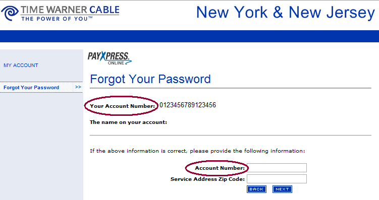
What is the point of prompting for something that you have just printed on the same page? Because our customers need frequent practice with their copy/paste keyboard shortcuts.
cemp
